ShopDreamUp AI ArtDreamUp
Deviation Actions


Suggested Deviants


Suggested Collections


You Might Like…


Featured in Groups


Description
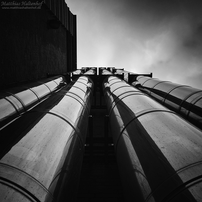
Up!
Image size
700x700px 155.61 KB
Make
Canon
Model
Canon PowerShot S95
Shutter Speed
1/1600 second
Aperture
F/4.0
Focal Length
7 mm
ISO Speed
100
Date Taken
Apr 9, 2011, 10:27:02 AM
Sensor Size
1mm
© 2011 - 2024 MatthiasHaltenhof
Comments12
Join the community to add your comment. Already a deviant? Log In
Well, this is my first official critique as I normally do not use this method to give feedback to the artist, but I wanted to do this in this case.
First of all I don't want to give any ratings, I really like this piece, but I don't think it is useful to rate, I don't want to judge. So I gave you every star, it is symbolic <img src="e.deviantart.net/emoticons/s/s…" width="15" height="15" alt="
Well, starting my critique... I really like the photo being black and white. It seems to fit perfectly to the steel and the contrasts, giving full attention to the lines and structures seen in the image and additionally it removes senseless information that could disturb the vision. The tones really add to the image and they free the picture from any aspect of time.
The composition as square is well-chosen, it underscores the symmetrical aspect of the image and it also crops away useless space (e.g. in the sky). I like the three main parts of the composition as the wall on the left, the sky and the pipes. This is really well-balanced, not too much black, not too much white. My eye is lead from the bottom of the image up to the sky that gives a dynamic feeling of width and this is a very important aspect in photography for me. Also notice the play of reflexions in the pipes, there is a lot to discover and an interesting distortion.
As always when I am looking at photography I ask myself what I would have done different, what may improve the vision.
So I am curious what this image would look like changing the angle, going out of symmetry by turning the camera a little clockwise, this could (I don't know for sure) be a way to get some diagonals at the end of the sky and maybe it was a little more 'closed' - I mean it would not be that open at the top, could be a little narrower. But this is just theory, maybe it could spoils the image completely. The only real thing I think one could improve here is sharpness, I'd try to sharpen the pipes a little more to get more details of the dust on it.
Finally, this could be a great subject for using longtime exposure to blur the sky and to get a little more drama here.
I hope that my critique is helpful and is being appreciated.
Thanks for sharing your art with us!